
Six Sigma Tools and Techniques: Which Tool Fits Which Business Problem
A workshop manager asks: "I have a binder of ten Six Sigma tools. Which one do I start with?" Start with the one that answers the question you cannot answer today. If you cannot say where the time goes, map the process. If you cannot say which complaint matters most, count and rank them. This guide matches six Six Sigma tools to six everyday problems, with an illustrative example for each.

Which Six Sigma tool should you start with when everything feels broken?
Business excellence sounds large, but it is built from small questions that a team can answer with a page of paper. Process excellence programmes bundle those questions with methodologies such as DMAIC and Lean; the tools are the part you pick up on a Monday morning. Most training lists them by project phase. That order is tidy, yet it is not how problems arrive. A manager does not wake up thinking "I am in the Measure phase". She thinks "customers are shouting", "nobody knows why jobs take so long" or "we fixed this last year and it came back".
So this guide is organised by the problem you are holding. The table is the whole map; each row has a section below with a worked example. The examples all come from one imaginary business, a 12-person bicycle repair workshop whose promise is "ready in three working days". Every figure in the examples is illustrative, invented to show the arithmetic, and none of it is real data.
| The problem you are holding | Tool to pick up | What it gives you | Where IASSC places it |
|---|---|---|---|
| "We cannot agree what this process includes." | SIPOC, voice of the customer | One shared page: who supplies what, what is delivered, and what the customer counts as good | 2.1.2 and 1.1.5 |
| "We do not know where the time goes." | Process map, value stream map | Every step with its working time and its waiting time | 2.1.2 |
| "There are too many complaints; which first?" | Pareto chart | A ranked list that shows where most of the pain sits | 1.2.4 |
| "Why does it keep happening?" | Fishbone diagram, 5 Whys | Sorted suspects, then one chain followed to a cause you can change | 2.1.1 (fishbone) |
| "Is it getting worse, or is that noise?" | Run chart, then a control chart | A time-ordered picture that separates drift from ordinary wobble | 2.2.4, 2.4.2, 2.4.4 |
| "Will the fix still be there in March?" | Mistake-proofing, control plan | A change that does not depend on memory, plus a named owner and a reaction rule | 5.1.3 and 5.3.2 |
The last column refers to topic numbers in IASSC's published Yellow Belt Body of Knowledge, read in October 2026. The Wikipedia entry on the seven basic tools of quality is a neutral place to see where several of these charts came from.
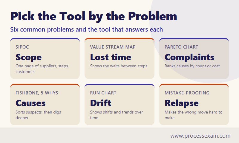
Why start from the problem rather than the phase?
A tool chosen because "it is the Analyze phase" tends to be applied to a question nobody asked. A Pareto chart drawn before anyone has agreed what counts as a complaint ranks the loudest voice, not the largest problem. A fishbone diagram drawn before the process is mapped fills with causes from the wrong step. Starting from the problem forces the first question, "what do I need to know?", and the tool follows. Phases still matter for the order of a full project, and the section on the exam below shows where they fall.
What should go on one page before anyone draws a chart?
Three small items: a SIPOC, the voices that define "good", and one measurable requirement. They take an hour and prevent weeks of arguing at the whiteboard.
SIPOC: the process on one page
SIPOC stands for suppliers, inputs, process, outputs, customers. It lists the five or six high-level steps of the process, no more, and what flows in and out of them. It is deliberately coarse; the detail comes later. Its job is to settle the boundary: where does the process start, where does it end, and who receives the result?
| Suppliers | Inputs | Process (high level) | Outputs | Customers |
|---|---|---|---|---|
| Riders who drop bikes off Parts distributor Bike brands (service manuals) |
The bike and a description of the fault Replacement parts Mechanic time |
Check in, assess and quote, get approval, repair, test and hand over | A repaired bike A bill that matches the quote A message saying it is ready |
Individual riders Local delivery firms with bike fleets |
Building this page exposes disagreements early. In the example, the owner thought the process ended when the repair was finished; the front desk thought it ended when the rider collected the bike. The difference is the two days in which a finished bike waits in the rack, and the SIPOC settles it: the customer's experience ends at collection, so the process does too.
Three voices, one requirement
The Body of Knowledge names the voice of the customer, the business and the employee. Each speaks differently. The rider says "I need it by Saturday". The business says "labour is most of our revenue, so idle bench time hurts". The mechanic says "half my day goes on chasing approvals". A good project writes all three down, because a fix that suits only one of them will be quietly undone by the other two.
Customers rarely state requirements in measurable form, so the team translates. A requirement that carries a measure is called a critical to quality characteristic, or CTQ. In the example the translation gives two CTQs: "bike collected on or before the promised day" and "final bill within 10% of the quote, unless the rider approved the extra work". Both can be counted. "Good service" cannot, which is why nothing else in this guide can start without this step.
Where does the time go between drop-off and collection?
A process map draws the steps in order. A value stream map goes one step further: under each step it records how long work is actually done and how long the job then waits. People are usually surprised by the ratio, because everyone in a busy workshop is busy and assumes the bike is too.
A value stream for one repair, drawn by walking it
Suppose the team follows ten bikes through the shop with a stopwatch and a clipboard, and uses typical values. Working time means hands on the bike or the paperwork; waiting time is the gap before the next step starts. One working day is counted as 8 hours, or 480 minutes.
| Step | Working time | Wait after the step | Who owns the wait |
|---|---|---|---|
| Check in at the counter | 10 min | 1 day in the intake rack | Workshop |
| Assess and write the quote | 20 min | 2 days for the rider to approve | Rider |
| Order parts, receive them | (counted in the wait) | 3 days from approval to parts on the bench | Workshop and distributor |
| Repair | 120 min | 0.5 day queuing for the test stand | Workshop |
| Test and clean | 25 min | 2 days until the rider collects | Rider |
| Total | 175 min | 8.5 days (4,080 min) |
The arithmetic is short. Working time is 10 + 20 + 120 + 25 = 175 minutes. Waiting time is 1 + 2 + 3 + 0.5 + 2 = 8.5 days, or 4,080 minutes. Elapsed time is 175 + 4,080 = 4,255 minutes, close to 8.9 working days. Lean calls the share of elapsed time spent on work the process cycle efficiency: 175 divided by 4,255 is about 4%. For 96% of the journey, nobody is touching the bike.
What the map changes about the conversation
Before the map the owner's theory was "the mechanics are too slow". The mechanics' 120 minutes of repair are 3% of the elapsed time, so speeding them up by a quarter saves about 30 minutes in nearly nine days. The big blocks are waits, and the table shows whose they are. Four of the 8.5 days belong to the rider, which points to how the shop asks for approval and announces readiness, not to anyone working harder. Three days sit between approval and parts, and that wait starts only because parts are ordered after the quote is approved. A team that sees this can test ordering the commonest parts ahead of approval.
The Body of Knowledge's list of seven wastes, a topic in the Define phase, includes waiting, along with overproduction, correction, inventory, motion, overprocessing and conveyance. A value stream map is how you find the waiting without relying on opinion. Two habits make the map trustworthy: walk the process yourself instead of drawing it from memory in a meeting room, and record the typical case and the worst case, since a map of the best day hides the problem.
Which complaints deserve attention first?
When feedback arrives as an undifferentiated pile, every complaint feels equally urgent and the loudest one wins. A Pareto chart replaces that feeling with a count. It sorts the categories from largest to smallest and adds a running total, so the few categories that carry most of the weight are visible at a glance. IASSC lists Pareto analysis, with the 80:20 idea behind it, under the Define phase.
Ranking a quarter of complaints
Imagine the workshop logs 200 complaints in a quarter and sorts them by the reason given:
| Complaint type | Count | Share | Running total |
|---|---|---|---|
| Bike not ready on the promised day | 84 | 42% | 42% |
| Bill higher than the quote | 52 | 26% | 68% |
| Wrong part fitted | 28 | 14% | 82% |
| Unclear or missing updates | 20 | 10% | 92% |
| Scratches or damage | 10 | 5% | 97% |
| Everything else | 6 | 3% | 100% |
Two of six types account for 136 of the 200 complaints, which is 68%. The chart does not say the rule is "always 80:20"; the principle is a pattern, not a law, and here the top three types reach 82%. What matters is that the team now has a defensible reason to leave scratches alone this quarter and to work on lateness and quote differences.
Count is not the only way to rank
A Pareto chart is only as good as the measure behind it. Ten complaints about damage might cost more in refunds than eighty about lateness. Draw the chart twice, once by count and once by cost or by customers lost, and compare. If the two rankings agree, the choice is easy. If they disagree, you have learned that the decision needs a conversation with finance, which is also useful. The Body of Knowledge pairs Pareto with cost of poor quality for the same reason: the aim is to rank by what the problem costs, not by how often someone mentions it.
One more discipline: the categories must be agreed before counting. If "late" and "no update" are allowed to blur, the same complaint is counted twice or filed under whichever box the clerk prefers, and the ranking drifts with the clerk. Write the category definitions on the same page as the chart.
How do you find why a problem happens without guessing?
A Pareto chart says what to work on. It says nothing about why. Two tools answer "why", and they suit different situations. The fishbone diagram, formally the cause and effect diagram, sorts many possible causes under headings so that none is forgotten. The 5 Whys follows one chain of causes downward until it reaches something the organisation can change. Use the first when the cause is unclear and the second when you already have a suspect.
Fishbone: listing the suspects by branch
Take the second complaint type, "bill higher than the quote", at 26%. The team gathers the mechanic, the front-desk clerk and the person who writes quotes, and builds branches for the effect:
| Branch | Possible causes the team lists |
|---|---|
| People | Quotes written by whoever is free; mechanics unsure who may approve extras |
| Method | No rule for re-quoting when new faults appear; quote template lacks a line for wear items |
| Materials | Part prices change between quote and order |
| Equipment and systems | Job card is paper; the till cannot show the original quote |
| Measurement | Nobody records how much a final bill differs from its quote |
| Environment | Saturday rush; the phone is at the counter, far from the bench |
The diagram is a list of suspects, not a finding. Its value is breadth: it moves the group past the first idea. Its risk is that everything on it feels equally true. The next step is evidence. In the Body of Knowledge, the X-Y diagram is the tool that ranks inputs by their suspected effect, and data collection settles which branches matter. Here the team pulls 20 recent jobs with a higher bill and finds that in 13 of them extra work was found during repair and nobody had asked the rider about it.
5 Whys: following the chain on the main suspect
- Why was the bill higher than the quote? The mechanic replaced a worn chain and cassette that were not on the quote.
- Why were they not on the quote? The wear was found only once the bike was on the stand.
- Why was the rider not asked before the work was done? The mechanic could not reach the rider, because only the front desk makes calls and the desk was busy.
- Why does only the front desk make calls? Nobody ever decided who may approve extra work, so the habit is to route everything through one person.
- Why was it never decided? The job card has no field for "extra work approved by", so the gap is invisible.
The last answer is a process fact that can be changed, which is the sign that the chain has gone deep enough. A chain that ends on "the mechanic was careless" has stopped one step too early; a person is rarely the cause, and a fix aimed at a person rarely lasts. The number five is a prompt, not a rule: some chains take three questions and some branch in two directions, in which case you follow both. Note too that the Yellow Belt Body of Knowledge, as published, names the fishbone diagram and not the 5 Whys, so treat the latter as a practical habit rather than an examinable topic.
Is the number drifting, or is that just noise?
Every process wobbles. Late jobs are 10 one week and 13 the next without anything having changed, and a manager who reacts to every wobble spends the year chasing shadows. A manager who ignores every wobble misses the week a real change began. Time-ordered charts exist to tell the two apart.
A run chart is the cheapest start
A run chart plots a measure in time order with a line at its median. It needs no software and no formulas. Suppose the workshop counts, each week, how many of its last 50 completed jobs were collected late. Over twelve weeks the counts are 10, 12, 9, 11, 10 and 12, then 13, 14, 13, 15, 14 and 16. The twelve values sorted run from 9 up to 16, and the median, the average of the sixth and seventh values (12 and 13), is 12.5.
The first six weeks all sit below 12.5 and the last six all sit above it. A common rule of thumb reads six or more consecutive points on one side of the median as a shift rather than chance, and textbooks vary a little on the exact number, so fix the rule before you look at the data. Here the average moved from about 10.7 late jobs in 50 (21%) to about 14.2 (28%). Nothing in a single week looks alarming, which is the point: the problem is in the pattern, and the run chart is how the pattern becomes visible.
When to move up to a control chart
A control chart adds limits calculated from the process's own history. For a count of late jobs out of 50, the usual limits would sit near 6% and 43%, so every weekly point falls inside them and no single week raises an alarm. This teaches a second lesson: control limits show what the process is able to do, not what the customer wants, and a process can be perfectly stable and still unacceptable. Stable at 28% late is a verdict on the design of the process, which only a change to the process can improve. Pattern rules, such as a long run on one side of the centre line, still flag the move from 21% to 28% that the limits alone would miss.
For the exam, stability is a named idea. IASSC's Yellow Belt Body of Knowledge lists graphical analysis, the concept of stability and monitoring techniques, but it does not name run charts or control charts. Learn what these charts show; do not assume a question will use their names.
What keeps a fixed problem from coming back?
Most improvement projects do not fail at the fix. They fail six months later, when the project team has moved on and the old habit returns. The last two tools are about making the new way the easy way and making relapse visible.
Mistake-proofing, or poka-yoke
Mistake-proofing changes the process so that an error cannot happen, or cannot pass unnoticed. The question to ask is not "how do we remind people?" but "what would make this mistake impossible?" Take the 14% complaint, "wrong part fitted". The root cause was that part codes were typed from a catalogue by hand. The mistake-proof is to scan the barcode on the bike's frame and the barcode on the part box when the order is placed; the screen refuses to confirm if the two do not match. No one has to remember anything.
The strength of a control rises as it relies less on attention. Training a mechanic to double-check is better than nothing; a checklist is better than training; a step that physically blocks the wrong action is better than a checklist. A reminder email, however well meant, is the weakest control of all, because it depends on being read on a bad day.
A control plan that names an owner
The control plan records what is watched, how, how often, by whom, and what happens when the reading is off. IASSC lists the elements of the control plan and the elements of the response plan as separate topics, and cost-benefit analysis sits next to them. A small version for the workshop:
| What is watched | How | How often | Owner | If it goes off target |
|---|---|---|---|---|
| Late collections, per 50 jobs | Run chart on the wall | Weekly | Workshop manager | Six points on one side of the median triggers a review of the value stream map |
| Extra work done without approval | Count on closed job cards | Every Friday | Front-desk lead | Review each case with the mechanic the same day |
| Part-scan mismatch rejections | Scanner log | Monthly | Parts clerk | Check that the scanner was not bypassed |
| Bill within 10% of quote | Spot check of 10 closed jobs | Monthly | Owner | Add the cause to the fishbone and rerun the 5 Whys |
Notice that the plan reuses the earlier tools: the run chart watches the outcome, the fishbone is reopened when a measure slips, and the CTQs from the first page are the targets. A toolkit works as a set because each tool feeds the next question.
Which of these tools does a Yellow Belt candidate have to know?
The IASSC Certified Lean Six Sigma Yellow Belt exam, code ICYB, is the entry credential that covers most of this toolkit. According to IASSC's Yellow Belt page, the exam covers the Define, Measure and Control phases; there are no Analyze or Improve sections in this Body of Knowledge. The full outline is on IASSC's Yellow Belt Body of Knowledge page. The tools in this guide map to it as follows.
| Tool in this guide | Body of Knowledge topic | Section |
|---|---|---|
| Voice of the customer, business and employee | 1.1.5 | Define |
| CTQs and cost of poor quality | 1.2.2 and 1.2.3 | Define |
| Pareto analysis | 1.2.4 | Define |
| Seven wastes, 5S | 1.4.4 and 1.4.5 | Define |
| Fishbone diagram | 2.1.1 | Measure |
| Process map, SIPOC, value stream map | 2.1.2 | Measure |
| X-Y diagram and FMEA | 2.1.3 and 2.1.4 | Measure |
| Graphical analysis, stability, monitoring techniques | 2.2.4, 2.4.2, 2.4.4 | Measure |
| Poka-yoke (mistake-proofing) | 5.1.3 | Control |
| Control plan and response plan | 5.3.2 and 5.3.3 | Control |
Those are the facts for the exam itself.
| Exam detail | ICYB |
|---|---|
| Full name | IASSC Certified Lean Six Sigma Yellow Belt |
| Vendor | IASSC |
| Questions | 60 |
| Duration | 120 minutes |
| Exam fee | USD 250 |
| Passing score | 70% |
IASSC describes the exam as closed book and proctored, and says some forms carry up to six extra ungraded questions. It lists no prerequisites. Confirm any change on IASSC's page before booking.
What do real projects and exam questions both punish?
The same few misuses spoil both a workshop project and a scenario question. The graphic below lists six of them, and each ties back to a section above.

The common thread is that a tool is an aid to a question, and the question comes first. A scenario item will often hand you a situation and ask which tool answers it, and the habit built in this guide, naming the problem before the tool, is the habit those items reward. To rehearse that matching on realistic items, the ICYB practice exam from ProcessExam gives you scenarios to match against the toolkit above, and the ICYB syllabus page sets out the topic list to tick off as you go.
Frequently Asked Questions
What are the main Six Sigma tools?
The tools most teams use are SIPOC, process maps and value stream maps, the Pareto chart, the fishbone diagram, the 5 Whys, run and control charts, mistake-proofing and the control plan. Each answers a different question, so choose by the problem in front of you rather than by project phase.
Which Six Sigma tool should a beginner learn first?
Learn the process map and the Pareto chart first. The map shows what actually happens and where jobs wait, and the Pareto chart ranks problems by count or cost. Both need only a pencil and honest data, and together they stop a team from fixing the wrong thing.
What is the difference between a fishbone diagram and the 5 Whys?
A fishbone diagram sorts many possible causes under headings, which suits a problem with no obvious suspect. The 5 Whys follows a single chain downward from one suspect until it reaches a cause that can be changed. Teams often use the fishbone first, then the 5 Whys.
Which Six Sigma tools does the IASSC Yellow Belt exam cover?
IASSC's Yellow Belt Body of Knowledge covers the Define, Measure and Control phases. It names SIPOC, process maps, value stream maps, fishbone diagrams, Pareto analysis, the X-Y diagram, FMEA, poka-yoke and control plans. The exam has 60 questions in 120 minutes, with a 70% pass mark.
How is a run chart different from a control chart?
A run chart plots a measure in time order against its median and reveals shifts and trends with no calculation. A control chart adds limits calculated from the process's own data, so it also shows whether the process is stable. A run chart is the cheaper first step.
- Lean Six Sigma |
- Six Sigma Business Strategies |
- Six Sigma Tools and Techniques |
- IASSC Lean Six Sigma Yellow Belt Sample Questions |
- ICYB Test Questions |
- Lean Six Sigma Yellow Belt PDF |
- IASSC Lean Six Sigma Yellow Belt Test Questions |
- Lean Six Sigma Yellow Belt Certification Requirements |
- IASSC ICYB BOK PDF |
- Lean Six Sigma Yellow Belt Certification Cost |
- ICYB Question Bank |
- ICYB Body of Knowledge (BOK)


