
How to Use a Fishbone Diagram: Steps, 6M and a Worked Example
A warehouse manager reads the weekly report and sees that too many outbound orders left the dock after the promised time. Everyone has a theory: the drivers, the pickers, the software, the weather. A fishbone diagram stops the theories turning into an argument, because it makes the team write every theory on one page, sort it by category, and then go and test the likely ones. Here is how to run one properly, from the blank board to the follow-up.

The diagram goes by three names: fishbone, Ishikawa and cause-and-effect diagram. All three are the same picture, a spine that ends in the problem with branches of possible causes leading into it. Kaoru Ishikawa, a Japanese quality-control specialist, popularised it in the 1960s, and the Wikipedia entry on the Ishikawa diagram gives the history. Below you will find the steps, the two category sets people use, one worked example you can copy, how to pair it with 5 Whys and a Pareto chart, and the ways teams misuse it.
Is a fishbone diagram a Six Sigma tool, and what is it for?
Yes, it is one of the standard quality tools used in Six Sigma projects, though it is older than Six Sigma and is used in healthcare, software, logistics and manufacturing alike. Its job is narrow and useful: it organises a brainstorm about why a problem happens, so that a group does not fixate on the first cause somebody names.
It answers one question, "What could be producing this effect?" It does not answer "Which of these is the real cause?" That second question needs data, which is why the diagram is a starting point for investigation and not a conclusion. Teams reach for it in three situations:
- The problem has many plausible causes and nobody can say which matter most.
- The team keeps returning to the same familiar explanation (usually "the people") and needs a prompt to look elsewhere.
- A process fails sometimes and not always, so the cause is probably a combination of conditions rather than one broken part.
Where it sits in a Six Sigma project is the middle: after the problem is defined and measured, before any fix is chosen. In the ASQ Certified Six Sigma Yellow Belt Body of Knowledge, cause and effect diagrams are named in the quality-tools item that also lists Pareto charts, flowcharts, run charts, check sheets, scatter diagrams and histograms, and the exam expects you to select and use them. Detail on that is in the table further down.
How do you draw a fishbone diagram, step by step?
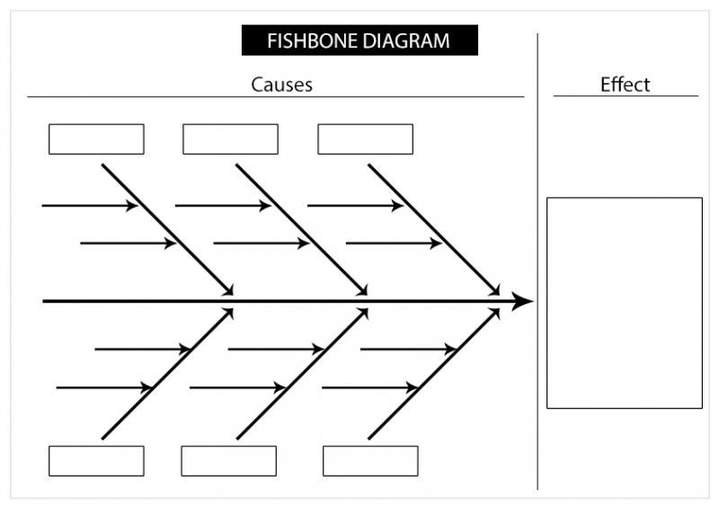
You need a whiteboard or a large sheet, markers, and four or five people who actually touch the process. Ten minutes of drawing then saves a week of guessing. A blank template looks like this:
Step 1: write the problem as a measurable effect
Put the problem in the box at the right-hand end of the spine, worded as something you can count. "Late deliveries" is vague. "Orders leaving the dock after the promised cut-off time" can be measured, and it tells the team what to look at. A fuzzy head produces a fuzzy diagram, so spend the first few minutes agreeing the wording and, where possible, how often it happens.
Step 2: draw the spine and choose the category branches
Draw a long horizontal arrow pointing at the problem, then angle four to six branches into it from above and below. Each branch gets a category name. The next section gives two ready-made sets; pick one before the brainstorm starts, because switching halfway splits the causes across two logics.
Step 3: brainstorm causes onto each branch
Ask the same question for each category: "What in this category could make the effect happen?" Everybody writes causes on sticky notes first, silently, then they are placed on the branch. Silent writing matters. When people call ideas out loud, the loudest or most senior voice sets the frame, and quieter people with first-hand knowledge say nothing.
Step 4: dig one level deeper on each cause
For every cause, ask "Why would that happen?" and draw the answer as a smaller bone off the cause. Two or three levels is normal. If a cause has no deeper bone, it is probably either a root cause or a vague word that needs to be made specific. "Poor communication" is an example of the second kind; ask who failed to tell whom what.
Step 5: look for the thin branches and the repeats
Step back and read the whole picture. A branch with almost nothing on it may mean nobody in the room knows that part of the process, so invite someone who does. A cause that shows up under two categories deserves a star, since it sits at a junction where two problems meet.
Step 6: mark the likely causes, then collect data
Vote with dots, each person placing a few on the causes they think matter most. The dots show where the team's belief is concentrated; they do not prove anything. Turn the top few into a testable question ("Do late orders cluster on one shift?") and go and count. This step is the one that gets skipped, and it is the one that turns a drawing into an improvement.
Step 7: record it and revisit it
Photograph the board or copy it into the project file, with the date and who was in the room. When the data comes back, strike through the causes the evidence rejects and keep the rest. The diagram is a living record of what the team believed and what it later confirmed or ruled out.
Which category headings should you use, 6M or a service set?
The category names are prompts, not laws. They exist to stop the group from stopping at one idea. Manufacturing teams usually start with the 6M set, and service and office teams with a 4S or process-step set. The cover picture shows the 6M layout: Machine, Material, Method, Measurement, Man Power and Mother Nature.
| Set | Categories | Where it fits best |
|---|---|---|
| 6M | Machine, Method, Material, Man (people), Measurement, Mother Nature (environment) | Production lines, laboratories, repair shops, warehouses and any process with equipment |
| 4S | Surroundings, Suppliers, Systems, Skills | Offices, banks, call centres and other service work |
| 8P | Product, Price, Place, Promotion, People, Process, Physical evidence, Performance | Marketing and sales problems |
| Your own | Names taken from the process steps (order, pick, pack, load, ship) | When no stock set fits and the process has clear stages |
Two practical points. First, "Man" is dated wording, and many teams now write "People" or "Manpower"; older textbooks still use the 6M name, so know both. Second, a process-step set, with one bone per stage of the workflow, is often the most natural choice for a service problem, since each bone then maps to a place where you could measure.
What does a finished fishbone look like for the late deliveries?
Take the warehouse from the start. The effect is "outbound orders leave the dock after the promised cut-off." The team picks the 6M set and brainstorms. The result might read like this (the entries are an illustration of how a team's notes could look, not data from a real site):
| Branch | Possible causes | One level deeper |
|---|---|---|
| Machine | Handheld scanners drop their connection; one conveyor stops often | Scanners are charged only at the end of the day; the conveyor belt is checked only after it fails |
| Method | Orders are released to the floor in one batch at mid-morning | Release time was set years ago and nobody has reviewed it against the carrier cut-off |
| Material | Packing cartons run out at the packing bench | Reorder point is set on average use, not on peak days |
| Man (people) | New pickers take longer on mixed-item orders | Training is a half-day walk-through with no check on pick accuracy |
| Measurement | "Late" is measured at the time of loading, not at the promised cut-off | Two shifts use different definitions, so the weekly report mixes them |
| Mother Nature (environment) | Heat on the upper mezzanine slows picking; dock doors are blocked in rain | No overflow staging area under cover |
Read it as a map of questions, not as answers. Two items stand out because they affect everything after them: the batch release time (Method) and the two definitions of "late" (Measurement). The second is a classic find. Until the team agrees what "late" means, any improvement claim is unreliable, so it comes first.
The team then turns the likely causes into checks. They pull a few weeks of order records and tally each late order by its main cause, split by shift and by order type. That tally is what feeds the next section.
How do 5 Whys and a Pareto chart work with a fishbone?
The three tools answer three different questions, and they work as a chain.
- Fishbone: what could be causing this, across every category?
- Pareto chart: which of those causes account for most of the occurrences, according to the data?
- 5 Whys: for the cause that matters most, why does it exist, one level at a time, until you reach something you can change?
From fishbone to Pareto: let the count choose
A Pareto chart is a bar chart with the bars sorted from tallest to shortest and a cumulative line on top, a picture of the common observation that a few causes produce most of the effect. The Pareto chart article on Wikipedia explains the principle. In practice, the fishbone gives you the category names for the tally and the Pareto chart shows which ones are worth the team's time. A tally for the warehouse could look like this (illustrative figures, to show the method):
| Cause recorded on late orders | Count of late orders | Share of all late orders | Running share |
|---|---|---|---|
| Released after the carrier-driven cut-off | 20 | 50% | 50% |
| Cartons out at the pack bench | 8 | 20% | 70% |
| Scanner connection dropped | 6 | 15% | 85% |
| Conveyor stopped | 4 | 10% | 95% |
| Other | 2 | 5% | 100% |
With 40 late orders in the tally, half trace back to one cause, and the first two together explain 70%. Fixing the scanners would feel productive but would touch only 15% of the problem. This is the whole point of pairing the two tools: the fishbone widens the search and the Pareto chart narrows it again, using counts instead of opinions.
From Pareto to 5 Whys: go down one chain
Now take the biggest bar and ask why, repeatedly. The 5 Whys method, described in the Five whys article, works like this on the warehouse:
- Why were these orders late? They reached the packing bench after the carrier cut-off.
- Why so late? The pick wave was released at mid-morning.
- Why mid-morning? Orders are released to the floor once, after the previous day's stock count is posted.
- Why wait for the count? The system was set up that way when the site had one carrier and one shift.
- Why has it not changed? Nobody owns the release schedule, and the cut-off times of the carriers are never compared with it.
The fifth answer is something you can fix: give the schedule an owner and release orders in two waves tied to the carrier times. Five is a guide, not a rule. Stop when the answer is a process or a decision someone controls, not a person to blame. One chain follows one branch; if the evidence shows two causes of similar size, run a chain for each.
Where does the fishbone appear in the Yellow Belt exam?
If you are studying for the ASQ Certified Six Sigma Yellow Belt, the diagram is examined as a tool you must be able to choose and use, and as one of several ways to reach a root cause. The figures below are from ASQ for the exam as sold, and the syllabus items are on the CSSYB syllabus page.
| What you need to know | ASQ CSSYB figure |
|---|---|
| Certification | ASQ Certified Six Sigma Yellow Belt (CSSYB) |
| Questions | 90 |
| Time (minutes) | 138 |
| Passing score | 550/750 |
| Fee (USD) | ASQ MEMBERS - $334; NON-MEMBERS - $434; RETAKES - $234 |
| Where cause and effect diagrams appear | Six Sigma Fundamentals (20 questions), quality tools, tested at the Apply level |
| Where 5 Whys appears | Analyze Phase (17 questions), root cause analysis, tested at the Understand level |
Two levels of knowledge are involved. For the cause and effect diagram you are asked to select and use it, so a question may describe a situation and ask which tool fits (a team has a long list of possible causes and wants to organise them by theme) or ask what the next step is after the diagram is drawn. For 5 Whys, you are asked to describe how it finds a root cause. The vendor's own listing is the ASQ Six Sigma Yellow Belt page.
Good practice for either question type is to remember what each tool does not do. A fishbone organises hypotheses; it does not rank them. A Pareto chart ranks counted events; it does not explain them. 5 Whys explains one chain; it does not show how common that chain is. Candidates who keep these three roles apart answer tool-selection questions faster, and the CSSYB practice exam is a way to check that you can do it under timed conditions.
How do teams misuse the fishbone diagram?
The tool is simple, and its common failures are about discipline, not drawing skill.
Treating the diagram as the answer
A diagram full of causes feels like progress, but each one is only a hypothesis. A team that picks the root cause by discussion and goes straight to a fix has skipped the evidence step. The dots in step 6 mark where to look; the counts decide.
Starting with a vague head
"Poor quality" or "customers unhappy" has no edges, so causes arrive from everywhere. If the head cannot be measured, narrow it until it can. If the problem has two distinct symptoms, draw two diagrams.
Letting one voice or one department fill the board
A fishbone built by the supervisor alone reflects the supervisor's view. Include the people who do the work, including the night shift and whoever hands work in from upstream. Writing causes silently first is the cheapest fix.
Blaming people in the "Man" branch
"Careless operator" ends the thinking. Ask what about the process allowed the error: unclear instructions, no check at the point of work, a rushed schedule. If the answer is always the person, the diagram has stopped working.
Stopping at the first level
A bone labelled "Equipment" with nothing under it is a category, not a cause. Push each cause down until you reach something specific you could verify on the floor.
Never going back to the board
The diagram should change as data arrives. If it is photographed once and filed away, it was a meeting exercise. Cross out the rejected causes, add the new ones, and keep the final version in the project record.
Using it for problems that have one obvious cause
If a machine is down because a fuse blew, replace the fuse. The diagram is for problems where causes are many, hidden or disputed. Using it for everything makes people stop taking it seriously.
How can you start using the tool this week?
Pick one recurring problem that you can count, such as repeat orders, rework, missed handovers or late reports. Book 45 minutes with the people who do the work. Spend ten minutes agreeing the head and the category set, fifteen on silent brainstorming, ten on the second-level "why" questions, and ten on dot voting and deciding which two causes to count first. Collect the numbers for a couple of weeks, draw the Pareto chart, and run 5 Whys on the top bar.
A short self-check after the session: is the head measurable, did every category get at least one cause, did the quieter members contribute, and is there a named person and date for the data collection? If any answer is no, fix that before anything is changed on the floor. Use it three or four times on real problems and the sequence becomes automatic, which is also what makes the tool questions on a Yellow Belt paper straightforward.
Frequently Asked Questions
How do you use a fishbone diagram?
State the problem as a measurable effect at the head, draw the spine and choose category branches, then brainstorm causes onto each branch and ask why for each. Mark the likeliest causes, collect data on them, and revise the diagram as evidence arrives. The drawing is only the start of the investigation.
Is a fishbone diagram a Six Sigma tool?
Yes. It is one of the standard quality tools used in Six Sigma projects, usually between measuring a problem and choosing a fix. It predates Six Sigma and is also used in healthcare, software and logistics. In ASQ's Yellow Belt outline it is listed as a cause and effect diagram.
What are the 6Ms of a fishbone diagram?
The 6Ms are Machine, Method, Material, Man (people), Measurement and Mother Nature (environment). They are prompt categories for the branches, mostly used for manufacturing and equipment-based processes. Service teams often use other sets such as Surroundings, Suppliers, Systems and Skills, or name branches after the process steps.
What is the difference between a fishbone diagram and 5 Whys?
A fishbone diagram widens the search by listing possible causes across several categories. 5 Whys narrows it by following one cause down a chain of why questions until it reaches something you can change. Teams often draw the fishbone first, pick the main cause with data, then run 5 Whys on it.
Does a fishbone diagram prove the root cause?
No. It organises hypotheses; it does not test them. A cause on the diagram is only a candidate until data confirms it, for example through a tally, a Pareto chart or a comparison of shifts. Treating the diagram as proof is the most common way teams misuse it.
- Six Sigma |
- ASQ Six Sigma Yellow Belt Sample Questions |
- ASQ Six Sigma Yellow Belt Test Questions |
- CSSYB Question Bank |
- CSSYB Exam Questions Download |
- CSSYB Test Questions |
- Six Sigma Yellow Belt PDF |
- ASQ Six Sigma Yellow Belt Book |
- ASQ CSSYB BOK PDF |
- Six Sigma Yellow Belt Certification Cost |
- Six Sigma Yellow Belt Certification Requirements |
- CSSYB Body of Knowledge (BOK) |
- CSSYB Handbook


